
This post is part of a series related to the Dead Simple Quilt along.

----
What do the design seed palettes and potato chips have in common? You can't just have one. Fortunately the color palettes are diet-friendly, so I am going to get my fill.
Here are my three favorite inspiration photos and palettes.

I did a quickie mock up with those colors to see how they played en mass.
What do you think?
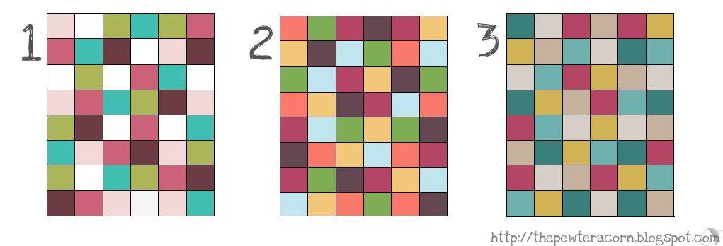
I'm truly torn. I was hoping that looking at them this way would make it easier to pick one.
Ya no. Not so much. Still love them equally. Poo.
I need your opinion! Favs? Hates? Loves?

----
What do the design seed palettes and potato chips have in common? You can't just have one. Fortunately the color palettes are diet-friendly, so I am going to get my fill.
Here are my three favorite inspiration photos and palettes.
I did a quickie mock up with those colors to see how they played en mass.
What do you think?
I'm truly torn. I was hoping that looking at them this way would make it easier to pick one.
Ya no. Not so much. Still love them equally. Poo.
I need your opinion! Favs? Hates? Loves?
This is fascinating because on straight palette I prefer the middle or last one...but when I saw your mock ups it was clear right away that I prefer the 1st Version!!! Hmmm...maybe this is exactly what I need to do with my choices too...it may make things clearer. Awesome job! Which will you pick?
ReplyDeleteThat's a tough call! They are all pretty, but I'm going to rank them...2, 3, then 1. Make sense? I think I'm just drawn more to warm colors, so I need a little orange or yellow in there. Except I just looked again and think I like 3 the best. Not so much help, huh?
ReplyDeleteI really like 1 and 2. They have a good range of values and the colors are beautiful. The dusty colors of number 3 don't appeal to me as much. Think about what you'll do with the finished quilt - will it be given away, will it go in a particular room... Maybe that will help you decide which palette to go with, because they're all good choices.
ReplyDeleteI was thinking of the embellished hues for a colour palette myself, so I definitely think I prefer that one, myself. It's something about the dusky hues, the blue, the pink, and the gold...
ReplyDeleteGreat way to look at things! My order of preference is 1, 3 then 2. 1 just seems bright and cheerful to me. Maybe i do need to add white to my palette afterall. Ahh!
ReplyDeleteI like all three but number 2 is edging the others out for me. I think it will be perfect for fall.
ReplyDeletei love the 3rd one!?, it is really hard to choose huh. i think i am going to have to do some mock ups too. because it really changes everything.
ReplyDeletei just posted my 3 choices, will you check them out? Thanks.
ReplyDeleteBased on the mockups, I think I prefer number 1. But I really like the colours in the third one too, so I'm now wondering what it would look like with white or black thrown into the mix
ReplyDeleteI think it might just be the first ever situation when I can choose something without hesitation: for me it's definitely 1 :)
ReplyDelete